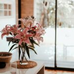
Imagine turning your home into a space that shows off your personality and style. Colors play a big role in how we feel and see things. Choosing the right colors for your home is key to making it look good and feel welcoming.
Learning about colors and how to use them can make your home feel more like you. By exploring colors and schemes, you can create a space that looks great and works well.
Key Takeaways
- Colors on home decor can greatly impact the ambiance and aesthetic of a living space
- Home decor color schemes should be chosen based on personal style and the intended use of the space
- Understanding color psychology can help in selecting the right colors for your home
- Colors can be used to create a sense of harmony and balance in a room
- Effective use of colors can elevate your home’s decor and make it more inviting
Understanding the Power of Colors on Home Decor
Colors are key in home decor, setting the mood and feel of a room. Popular paint colors can change a room’s vibe. Knowing color psychology helps make spaces welcoming and balanced.
Color psychology is about how colors affect us. It’s complex but important for a good home feel. The color wheel is a tool to pick colors that work well together.
The Basic Color Wheel Explained
The color wheel shows colors and their connections. It has primary, secondary, and tertiary colors. Primary colors like red, blue, and yellow can’t be mixed. Secondary colors, like green and orange, come from mixing two primaries.
Tertiary colors mix primary and secondary colors. They offer more hues and shades. This variety helps in choosing the right colors for your space.
How Colors Affect Space Perception
Colors change how we see a space. Lighter colors make rooms seem bigger. Darker colors make them feel cozier.
Choosing the right colors is key for a good space. It’s about balance and harmony. This makes your home both functional and beautiful.
Creating Visual Balance Through Color
Visual balance is crucial for a nice space. Using colors that go well together is important. Popular paint colors like beige and gray help.
Understanding color psychology lets you create a space that shows your style. It’s about making a home that feels like you.
| Color | Emotion | Effect on Space |
|---|---|---|
| Red | Energy, passion | Creates a sense of excitement and warmth |
| Blue | Calmness, serenity | Creates a sense of tranquility and relaxation |
| Green | Nature, growth | Creates a sense of balance and harmony |
Modern Color Psychology in Interior Design
In interior design, color psychology is key. It helps make spaces that show who we are and how we live. Today’s trendy home decor colors and interior design color trends change with culture and society. For example, more people want calming colors and natural materials because of wellness and self-care.
Modern color psychology uses colors to stir feelings and set moods. Interior design color trends mix bold and neutral colors for balance. Colors like blue, green, and yellow are popular for their calming effects.
- Use color to create a mood or atmosphere
- Balance bold colors with neutral shades
- Consider the natural light and how it affects the colors in your space
By knowing the latestinterior design color trendsandtrendy home decor colors, you can make a space that shows your personality. It also boosts well-being and happiness.
Selecting Your Perfect Color Palette
Choosing the right color palette is key to a harmonious home. Think about the natural light, furniture, and decor in your space. This helps pick the main colors for the room. Adding accent colors can make a room pop, but balance them with the main colors to avoid too much.
A good color palette can change a room’s mood and feel. Start with the 60-30-10 rule. This means 60% of the room is a main color, 30% is a secondary color, and 10% is an accent color. This rule helps create a balanced look. For instance, a bold accent color should be used sparingly to add personality.

Primary Color Selection
Primary colors are the base of your palette. They should match your style and the room’s decor. Look at your furniture, flooring, and walls to pick your primary colors. Online tools or a professional can help find the right colors for you.
Complementary Color Choices
Complementary colors are pairs that are opposite each other on the color wheel. They add depth and interest to your space. For example, blue and orange make a bold and vibrant pair.
Accent Color Implementation
Accent colors bring personality to your space. Use them sparingly to keep the room balanced. Think about using them for items like throw pillows, vases, or rugs. This way, you can add color without committing to a single scheme.
Current Interior Design Color Trends
Staying current with interior design color trends is key. This year, trendy home decor colors mix bold and neutral shades. Earthy tones like terracotta and sage green bring warmth and coziness.
Choosing the right colors depends on the look you want. Soft tones create calm, while bold colors add energy. Some top trendy home decor colors include:
- Blues and whites for a coastal vibe
- Greens and neutrals for a natural feel
- Corals and yellows for a lively atmosphere
Using these interior design color trends and trendy home decor colors can make your space stylish and personal. Whether updating one room or your whole home, knowing the latest colors helps you achieve your desired look.
Room-by-Room Color Strategy
Choosing colors for home decor is key. Each room has its own needs and functions. A good color scheme can make a space more comfortable and welcoming. We’ll look at design principles and color strategies for each room.
Colors can change a room’s mood and feel. Warm colors like orange and red make a space cozy and lively. Cool colors like blue and green help you relax. Think about the room’s purpose and lifestyle when picking colors.
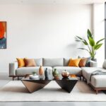
Living Room Color Schemes
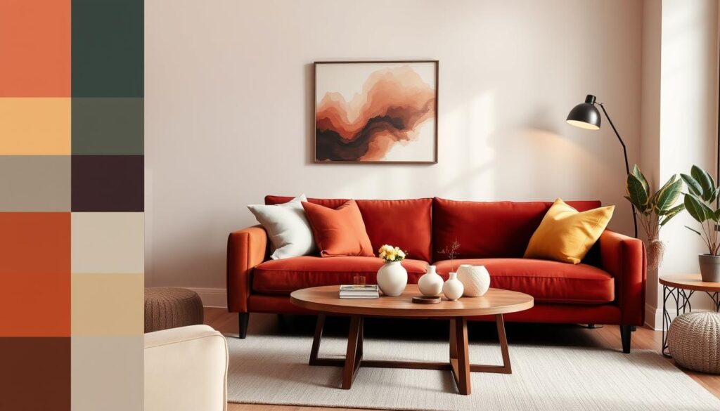
The living room is where we spend time together. Choose colors that encourage conversation and comfort. Earthy tones like beige and brown are warm and inviting. Bold colors like yellow and red add energy.
Bedroom Color Solutions
The bedroom is our retreat for rest. A calming color scheme helps us relax and sleep better. Soft colors like light blue and pale green are soothing. Rich colors like navy and charcoal add coziness.

Kitchen and Dining Area Colors
The kitchen and dining area are where we share meals. A good color scheme makes these spaces more enjoyable. Bright colors like yellow and orange add warmth. Neutral colors like white and gray offer a modern look.
Bathroom Color Considerations
The bathroom is our morning and evening space. A thoughtful color scheme can make it relaxing. Calming colors like blue and green promote serenity. Bold colors like red and purple add luxury.
Think about each room’s unique needs when choosing colors. Pick colors that reflect your style and lifestyle. Don’t be afraid to try new things and have fun.
Working with Neutral and Bold Colors
Designing a harmonious space means balancing neutral and bold colors. Popular paint colors are a good starting point, showing current trends. They help create a space that looks good and feels right.
It’s important to know how neutral and bold colors work together. Neutral colors can calm a room, letting bold colors shine. Bold colors can make a neutral room lively. This mix makes a space feel welcoming and complete.

- Start with a neutral base: Use neutral colors for walls, floors, and furniture to create a calm foundation.
- Add bold accents: Incorporate bold colors through accessories, rugs, or statement pieces to add personality to the space.
- Consider the 60-30-10 rule: Allocate 60% of the room to a neutral color, 30% to a secondary color, and 10% to an accent color.
Using these tips and thinking about color psychology can make a space beautiful and useful. Whether you want a calm or lively room, knowing how to mix colors is key.
Color Coordination with Existing Furnishings
Choosing the right color palette for your home is key. You need to think about your furniture, wood tones, metallics, and textiles. Pick accent colors that match these to make your space look great. Start by looking at the colors in your furniture and decor.
Think about the color of your wood furniture, like oak or maple. Pick accent colors that make these tones pop. For oak, warm beige or golden brown works well. Metallics like gold or silver need colors that match their tone. For gold, try rich jewel tones like emerald green or navy blue for a fancy look.
Here are some tips for matching colors with your furniture:
- Match warm wood tones with earthy accent colors, such as terracotta or sienna.
- Complement cool metallic elements with calming accent colors, such as soft blue or pale gray.
- Harmonize bold textiles with neutral accent colors, such as cream or beige.
By using these tips and picking the right colors, you can make a beautiful space that shows off your style. Think about how your accent colors work with your furniture for a cohesive look.
| Color | Complementary Color |
|---|---|
| Warm wood tones | Earthy accent colors (terracotta, sienna) |
| Cool metallic elements | Calming accent colors (soft blue, pale gray) |
| Bold textiles | Neutral accent colors (cream, beige) |
Common Color Mistakes to Avoid
Choosing the right colors for your home decor can be tough. Many people make mistakes that can ruin the look of their space. Understanding home decor color schemes is key. The right colors can make a room feel welcoming, while the wrong ones can make it feel cold.
Some common errors include inconsistent color temperatures and insufficient contrast. These can make a room look messy or dull. To steer clear of these issues, here are some tips:
- Choose colors that complement each other in terms of temperature and hue
- Use a mix of warm and cool colors to create visual interest
- Don’t be afraid to add neutral colors to balance out bold hues
By avoiding these mistakes and picking the right colors, you can make your space beautiful and useful. Remember, colors can change a room’s feel. So, take your time to choose wisely.
Creating a harmonious color scheme is all about finding the right balance between different hues and temperatures. By doing so, individuals can create a space that is not only visually appealing but also comfortable and inviting.
Conclusion: Transforming Your Space with Confidence
Color is a powerful tool for making your living spaces better. It can show off your unique style. By learning about colors and using them right, you can make your home look great and feel like you.
We’ve talked about how color affects us and how to pick the right colors. Now, you can start your home projects with confidence. You’ll know how to choose colors that fit your vision and make your home look amazing.
Color can change your home in big ways. It can make your space beautiful and show off who you are. So, go ahead and use color to make your home special. Try new things and follow your gut – the possibilities are endless!
FAQ
What are the key factors to consider when choosing colors for home decor?
When picking colors for your home, think about the room’s purpose and the colors of your furniture and walls. Also, consider the mood you want to create and the overall color scheme of your home. Understanding color theory helps you see how colors can change how we feel in a room.
How do I create a balanced and harmonious color palette for my home?
To get a balanced color palette, start with a main color. Then, add colors that go well with it, like complementary or analogous colors. Use neutral colors to calm the space and add vibrant colors to make it pop. Keeping things consistent helps your home look cohesive.
What are some of the current interior design color trends?
Today, earthy tones like sage green and terracotta are popular. So are bold colors like mustard yellow and deep plum. Neutral colors with warm undertones, like beige, are also trending. These colors aim to make your space feel both timeless and modern.
How can I use color to make a room feel more spacious or cozy?
Light colors like whites and blues can make a room feel bigger. Darker colors like reds and oranges can make it feel cozier. How you use these colors and lighting matters a lot for the feel of the room.
What are some common mistakes to avoid when choosing colors for home decor?
Don’t use too many colors or make everything match too much. Also, pay attention to color undertones and make sure they match your furniture and walls. Always test colors in your space before deciding, as they can look different in person than on a swatch or screen.