Stress-Reducing Colors for a Calming Home

Discover the stress-reducing power of colors in your home decor. Our guide reveals the best colors to create a calming, relaxing environment.

Stress-Reducing Colors in Home Decor

Can the colors in our homes really impact our stress levels? The answer lies in the psychology of color and its effect on our mood and well-being. We all need a peaceful retreat from the stresses of everyday life.

One effective way to create a calming atmosphere is by using soothing hues that promote relaxation and serenity. By understanding the impact of different colors on our emotions, we can make informed decisions to create a more tranquil home environment.

As we explore the science behind color psychology, we’ll discover how various colors can influence our mood and help us unwind.

Key Takeaways

  • Understanding the psychology of color can help create a calming home atmosphere.
  • Certain colors can reduce stress and promote relaxation.
  • Soothing hues can be strategically used in home decor to enhance serenity.
  • A well-designed color scheme can positively impact our mood and well-being.
  • Creating a peaceful retreat at home is achievable with the right colors.

The Science of Color Psychology in Home Environments

Understanding the science behind color psychology can help us create home environments that promote relaxation and reduce stress. Colors have a profound impact on our emotions and physiological responses, and research has shown that certain colors can lower blood pressure, heart rate, and stress levels.

How Colors Affect Our Mood and Stress Levels

Colors can evoke different emotional responses, influencing our mood and stress levels. For instance, calming colors such as blue and green are known to promote relaxation, while stimulating colors like red and orange can increase energy and alertness. By choosing the right colors for our home environments, we can create spaces that support our well-being.

The Physiological Impact of Different Color Wavelengths

Different colors have varying wavelengths, which can affect our physiological responses. For example, colors with longer wavelengths, such as red and orange, can increase heart rate and alertness, whereas colors with shorter wavelengths, like blue and violet, can have a calming effect. Understanding the physiological impact of different color wavelengths can help us make informed decisions about the color schemes in our homes.

Research-Backed Evidence on Color and Stress Reduction

Numerous studies have investigated the impact of color on stress reduction. As noted by experts, “The strategic use of color in interior design can significantly reduce stress levels and promote relaxation.” By applying research-backed principles of color psychology, we can create home environments that support our mental and emotional well-being.

Stress-Reducing Colors in Home Decor: A Comprehensive Guide

A cozy, well-lit living room with calming, stress-reducing colors in the home decor. The walls are painted in a soft, neutral tone of pale blue, complemented by plush, dove gray sofas and armchairs. Accent pillows in shades of sage green and lavender add pops of soothing color. A large, floor-to-ceiling window floods the space with warm, natural light, creating a serene and tranquil atmosphere. Wooden furniture, such as a minimalist coffee table and floating shelves, add natural textures. Potted plants and a woven rug in muted tones complete the calming, zen-like ambiance.

Creating a peaceful home environment is crucial for our well-being, and one effective way to achieve this is by incorporating stress-reducing colors into our decor. The right color choices can significantly impact our mood and stress levels, promoting harmony through color choices in our living spaces.

The Spectrum of Calming Colors

Calming colors span a wide spectrum, from soft pastels to deep, rich tones. These colors can be broadly categorized into warm and cool hues, each having a distinct effect on our relaxation levels.

Warm vs. Cool Colors for Relaxation

Warm colors, such as terracotta and golden brown, can create a cozy and inviting atmosphere, while cool colors like blues and greens tend to have a more calming effect. Understanding the differences between these color temperatures is key to selecting the most appropriate hues for relaxation.

  • Warm colors: terracotta, golden brown, beige
  • Cool colors: blues, greens, purples

Neutral Tones and Their Soothing Properties

Neutral tones, including beige, gray, and white, offer a versatile and soothing palette for home decor. These colors can help create a sense of calm and serenity, making them ideal for bedrooms and living areas.

By understanding the spectrum of calming colors and the differences between warm and cool hues, we can make informed decisions about our home decor. Incorporating stress-reducing colors into our living spaces can significantly enhance our overall well-being and promote a more peaceful home environment.

Blue: The Ultimate Tranquility Color

In the realm of color psychology, blue stands out as a promoter of relaxation. We often turn to blue when seeking to create a calming atmosphere in our homes. The various shades of blue offer a range of effects, from soothing light sky blues to deeper, richer navy blues.

Different Shades of Blue and Their Effects

Light blue shades can make a room feel more spacious and airy, promoting a sense of calmness. On the other hand, darker blues can create a cozy, intimate atmosphere, ideal for bedrooms. Navy blue, for instance, can add a sense of luxury and tranquility.

Best Rooms for Blue Color Schemes

Blue is versatile and can be used in various rooms, but it’s particularly effective in bedrooms and bathrooms. In bedrooms, blue can promote relaxation and improve sleep quality. In bathrooms, it can create a spa-like ambiance.

Complementary Colors to Enhance Blue's Calming Effect

To enhance the calming effect of blue, we can pair it with complementary colors. White and light gray are excellent choices as they add a clean and serene touch. For a bolder look, coral or yellow can be used as accent colors, creating a nice contrast with blue.

Blue ShadeBest Used InComplementary Colors
Light BlueBedrooms, Living RoomsWhite, Pale Yellow
Navy BlueBedrooms, StudiesGold, Cream
Sky BlueLiving Rooms, BathroomsSoft Gray, Beige

Green: Bringing Nature's Serenity Indoors

A serene, sun-dappled garden scene with lush, verdant foliage. In the foreground, a tranquil pond reflects the swaying branches of towering willow trees, their delicate leaves casting a gentle, calming pattern of light and shadow. The middle ground features a meandering stone pathway, flanked by vibrant flower beds in shades of emerald, jade, and forest green. In the background, a glimpse of a cozy, rustic cabin nestled amid a rolling hillside, surrounded by the verdant embrace of a thriving, therapeutic natural landscape. Soft, diffused natural lighting creates a soothing, contemplative atmosphere, inviting the viewer to experience the restorative power of nature's green hues.

Green hues can transform your home into a peaceful retreat by leveraging the principles of biophilic design. By incorporating green into your decor, you can create a calming atmosphere that reduces stress and promotes well-being.

The Connection Between Green and Biophilic Design

Biophilic design emphasizes the human connection to nature. Green, being a color closely associated with the natural world, plays a crucial role in this design philosophy. It helps in creating spaces that feel more organic and calming.

Ideal Green Hues for Different Living Spaces

Different shades of green can be used in various rooms to achieve the desired effect. For instance, soft mint green can be used in bedrooms for a soothing ambiance, while sage green can add a touch of serenity to living rooms.

RoomIdeal Green HueEffect
BedroomSoft Mint GreenSoothing Ambiance
Living RoomSage GreenSerene Atmosphere
Home OfficeFresh GreenBoosts Focus

Pairing Green with Natural Elements for Maximum Calm

To amplify the calming effects of green, it’s beneficial to pair it with natural elements such as wood, stone, and plants. This combination enhances the biophilic design elements, creating a more peaceful living environment.

By thoughtfully incorporating green and natural elements, we can create a home that feels like a serene escape from the stresses of everyday life.

Soft Neutrals and Pastels for Peaceful Living

When it comes to creating a peaceful home, soft neutrals and pastels are often the unsung heroes. These calming colors can significantly reduce stress and promote relaxation in our living spaces.

The Understated Power of Beige, Gray, and White

Neutral tones such as beige, gray, and white are incredibly versatile and can create a serene atmosphere in any room. Beige provides warmth without being overwhelming, while gray offers balance and neutrality. White, on the other hand, can make spaces feel larger and more airy. These colors work together to create a soothing palette that can be adapted to various decorating styles.

Using these neutral tones, you can design a calming backdrop for your furniture and decor, allowing you to add pops of color or texture without overwhelming the senses.

Lavender, Blush, and Other Stress-Reducing Pastels

Pastel colors like lavender, blush, and soft mint can add a touch of tranquility to your home. Lavender is known for its calming effects, while blush tones bring a sense of warmth and coziness. These gentle hues can be used as accent colors or incorporated into your overall color scheme to create a peaceful ambiance.

Creating Depth with Monochromatic Neutral Schemes

A monochromatic neutral color scheme can add depth and interest to your home without being overwhelming. By using different shades of a single neutral color, you can create a cohesive and calming environment. This approach allows you to experiment with various textures and tones, adding complexity to your space while maintaining a serene atmosphere.

For example, a monochromatic gray scheme can range from light gray walls to dark charcoal accents, creating a sophisticated and peaceful living space.

Room-by-Room Color Strategies for a Calming Home

To achieve a calming home environment, it’s essential to adopt room-by-room color strategies that cater to the specific needs of each space. Different rooms serve different purposes, and the right color can enhance the function of each area while promoting overall calm.

Bedroom Colors for Better Sleep and Relaxation

The bedroom is a sanctuary for rest and relaxation. Soft blues and pale greens are ideal for creating a calming atmosphere that promotes better sleep. These colors have a soothing effect on the mind and body, helping to reduce stress and anxiety.

Living Room Hues for Social Harmony

The living room is where we socialize and spend quality time with family and friends. Warm neutrals like beige and soft grays can create a welcoming and harmonious environment. These colors encourage conversation and togetherness without being too overpowering.

Home Office Colors for Focus Without Stress

A home office needs to be a space that fosters productivity without inducing stress. Muted greens and blues can help achieve this balance by promoting focus and calmness. These colors can help reduce eye strain and improve concentration.

Kitchen and Dining Area Colors for Mindful Eating

The kitchen and dining areas are where we nourish our bodies. Warm colors like terracotta and soft yellows can stimulate appetite and create a cozy atmosphere. However, it’s essential to balance these warm tones with neutral elements to avoid overwhelming the senses.

Bathroom Colors for Spa-Like Tranquility

Bathrooms should be oases of relaxation. Soft whites, creams, and pale blues can evoke the feeling of a spa, promoting tranquility and calmness. These colors can make the bathroom feel like a serene retreat.

RoomRecommended ColorsBenefits
BedroomSoft blues, pale greensBetter sleep, relaxation
Living RoomWarm neutrals (beige, soft grays)Social harmony, welcoming atmosphere
Home OfficeMuted greens, bluesFocus, reduced stress
Kitchen/DiningWarm colors (terracotta, soft yellows)Mindful eating, cozy atmosphere
BathroomSoft whites, creams, pale bluesSpa-like tranquility

By implementing these room-by-room color strategies, you can create a calming home environment that supports the unique needs of each space, promoting overall well-being and serenity.

Creating Harmony Through Color Combinations

When it comes to designing a calming home, combining colors effectively is just as important as choosing the right individual hues. A harmonious color scheme can create a sense of balance and tranquility, making your living space a true sanctuary.

The 60-30-10 Rule for Balanced Color Distribution

One effective way to achieve a balanced color distribution is by using the 60-30-10 rule. This rule suggests that 60% of the room should be a dominant color, 30% a secondary color, and 10% an accent color. This distribution creates a visually appealing and harmonious atmosphere.

Color Palettes That Promote Tranquility in Decor

Certain color palettes are known to promote tranquility. For example, combining soft blues with creamy whites and natural wood tones can create a calming environment. Similarly, pairing muted greens with earthy tones can bring a sense of serenity to your home.

Seasonal Adjustments to Your Color Scheme

To keep your home feeling fresh and inviting, consider making seasonal adjustments to your color scheme. For instance, adding warmer tones in winter or cooler tones in summer can create a sense of harmony with the changing seasons.

Personalizing Peaceful Home Colors to Your Preferences

Ultimately, the most effective color combinations are those that reflect your personal preferences and personality. Experiment with different hues and combinations to find what works best for you and your family.

Practical Implementation: From Selection to Application

Transforming your home into a tranquil oasis requires more than just picking the right colors; it demands thoughtful implementation. As we put our chosen stress-reducing colors into action, several key considerations come into play.

Testing Colors Before Committing

Before fully committing to a specific color, it’s essential to test it in your space. Paint a small section of the wall or use colored samples to gauge how the color looks at different times of day and under various lighting conditions. This step helps ensure the chosen color achieves the desired calming effect.

Working with Existing Furniture and Decor

When introducing new colors, it’s not always necessary to start from scratch. We can work with existing furniture and decor to create a harmonious and calming environment. Consider the colors of your furniture, rugs, and decorative items, and choose a stress-reducing color that complements them.

Budget-Friendly Ways to Introduce Calming Colors

Creating a calming home doesn’t have to break the bank. There are several budget-friendly ways to introduce stress-reducing colors, such as adding throw pillows, blankets, or curtains in soothing hues. These small changes can make a significant impact on the overall ambiance of your home.

Common Mistakes to Avoid When Using Colors for Stress Reduction

While implementing stress-reducing colors, it’s crucial to avoid common mistakes such as choosing colors that are too bold or overusing a single color. Balance is key to creating a truly calming environment. By being mindful of these potential pitfalls, we can ensure our efforts to reduce stress through color are effective.

Conclusion

By applying the principles of color psychology, we can create a calming home that nurtures our well-being. Stress-reducing colors play a crucial role in this process, influencing our mood and stress levels.

We’ve explored various stress-reducing colors, including blue, green, and soft neutrals, and discussed how to use them effectively in different rooms. By choosing the right colors and combinations, we can create a peaceful living environment that promotes relaxation and serenity.

As we implement these strategies, we encourage you to experiment with different colors and find what works best for you. By doing so, you’ll be able to create a calming home that not only looks beautiful but also supports your mental health.

By incorporating stress-reducing colors into your home decor, you’ll be taking a significant step towards creating a peaceful living space that enhances your overall quality of life.

FAQ

What are stress-reducing colors, and how do they work?

Stress-reducing colors are hues that have a calming effect on our mood and well-being. They work by influencing our emotions and physiological responses, such as lowering blood pressure, heart rate, and stress levels, creating a more peaceful atmosphere in our homes.

How do I choose the right stress-reducing color for my home?

To choose the right stress-reducing color, consider the specific needs of each room, the natural light, and your personal preferences. Understanding the principles of color psychology and exploring different color palettes can help you make an informed decision.

Can I use stress-reducing colors in every room of my home?

Yes, you can use stress-reducing colors in every room, but the specific color and shade may vary depending on the room’s purpose and your personal preferences. For example, blue is often used in bedrooms, while green is commonly used in living areas.

How do I combine stress-reducing colors with other colors to create a harmonious environment?

To combine stress-reducing colors with other colors, consider the 60-30-10 rule, where 60% of the room is a dominant color, 30% a secondary color, and 10% an accent color. You can also explore color palettes known to promote tranquility and make seasonal adjustments to keep your home feeling fresh.

Are there any budget-friendly ways to introduce stress-reducing colors into my home?

Yes, there are budget-friendly ways to introduce stress-reducing colors, such as painting one wall, adding throw pillows, or incorporating natural elements like plants or a vase with branches. You can also repurpose existing furniture and decor to work with your chosen color scheme.

What are some common mistakes to avoid when using stress-reducing colors?

Common mistakes to avoid include not testing colors before committing, neglecting to consider the room’s natural light, and failing to balance colors effectively. It’s also essential to avoid overusing a single color, as this can lead to visual monotony.

How can I personalize stress-reducing colors to my preferences?

To personalize stress-reducing colors, consider your favorite hues, the colors that evoke positive emotions, and the overall aesthetic you want to achieve in your home. Experimenting with different shades and combinations can help you find the perfect balance of calm and style.

The Ultimate Beginner’s Guide to Houseplant Care

Unlock the keys to successful houseplant care with our easy-to-follow Beginner's Guide to Caring for...

Grow & Use These Kitchen Herbs in Cooking

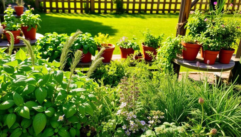
Learn how to grow and use these essential kitchen herbs in your cooking for vibrant, flavorful...

Decorating Your Home Stylishly on a Tight Budget

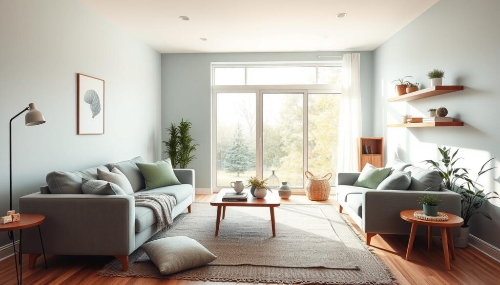
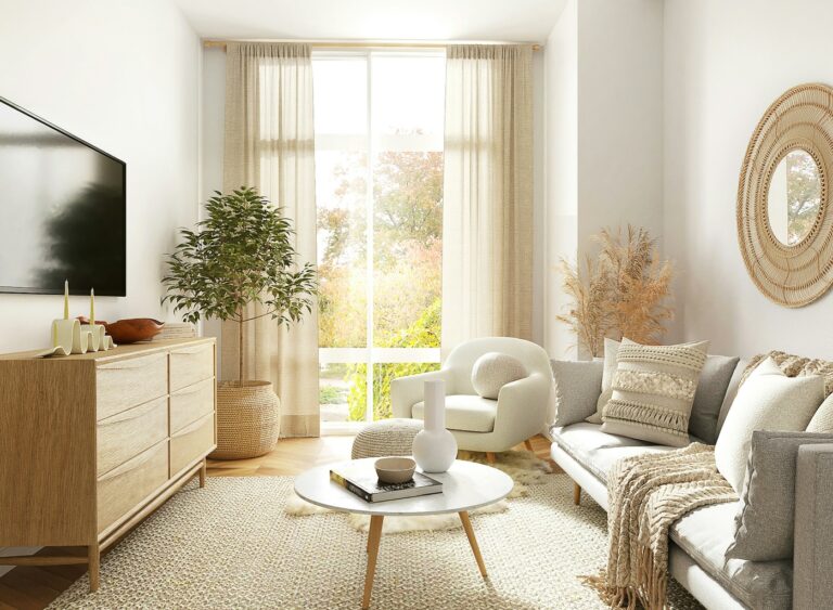
Learn my secrets for creating a beautiful, high-end look in your home using a limited budget...

Top 5 Bedroom Colors for Ultimate Relaxation

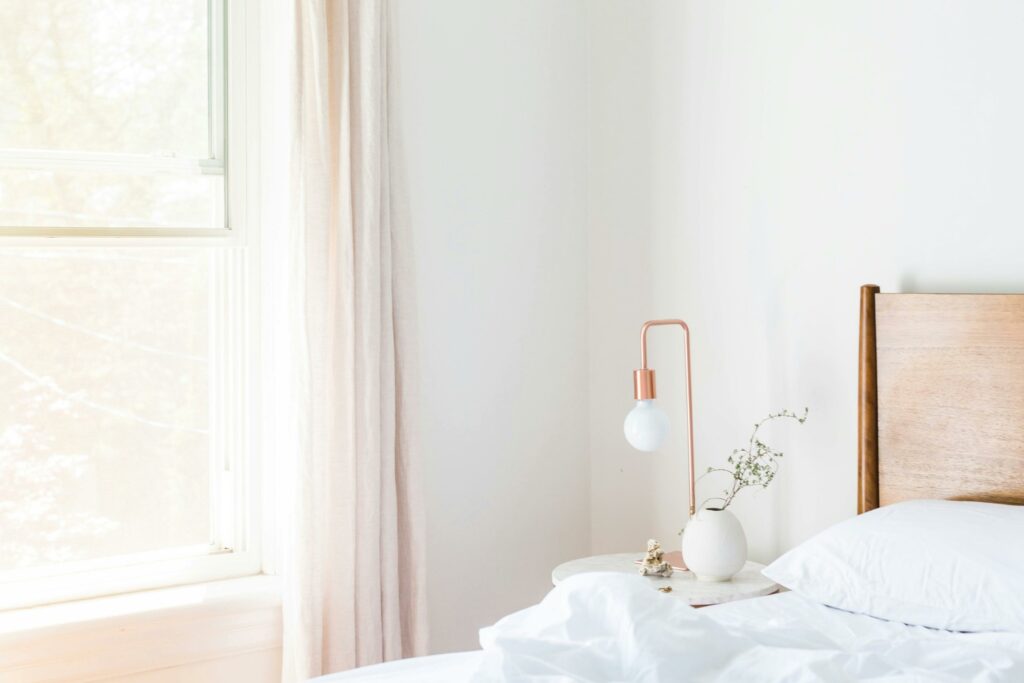
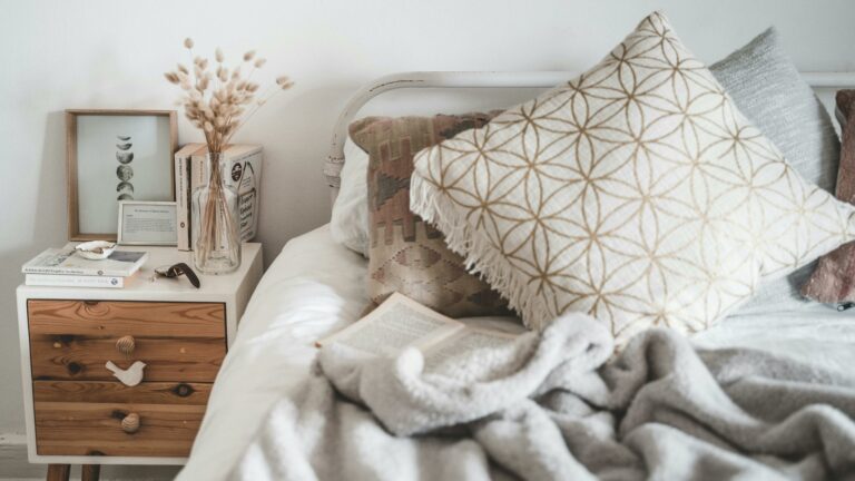
Transform your bedroom into a serene oasis with our expert-recommended top 5 relaxation colors...

The Surprising Ways Home Colors Influence You

Explore the unexpected ways your home's colors can impact your mood, energy, and overall well-being...

Stress-Reducing Colors for a Calming Home

Discover the stress-reducing power of colors in your home decor. Our guide reveals the best colors...

Decorating a Small Space? Shop Online for the Perfect Fit

Shop online for the ideal furnishings and decor to transform your small space...

Top 5 Must-Have Victorian Decor Elements for Your Home

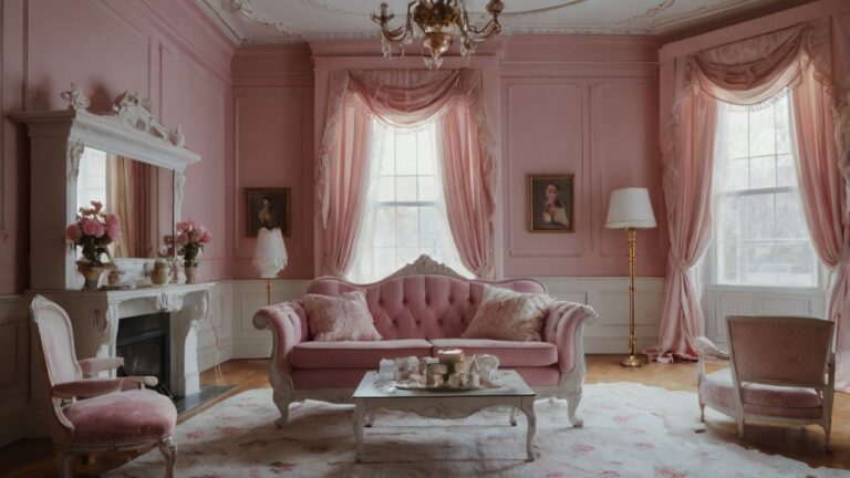
Discover the top 5 must-have Victorian decor elements to transform your home into a timeless oasis...

Organize Your Kitchen Efficiently: Essential Tips

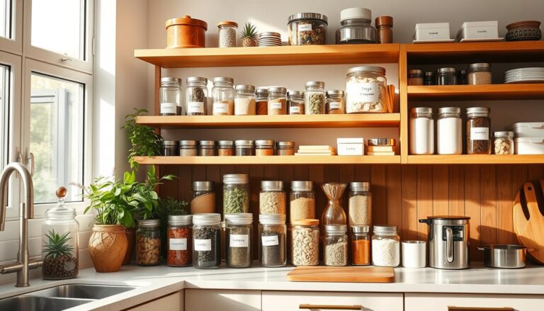
Organize your kitchen with ease using our top tips to make the most of your space...
Review Your Cart
0
Add Coupon Code
Subtotal